Triple Your Confidence in Chart Trendlines with Volume Profile

(6 minute read)
SIDESTEP FAKE BREAKS AND PINPOINT ZERO-HESITATION REVERSAL SIGNALS
The trend is your friend.
It's one of the most overused trading clichés. It sounds so welcoming and easy.
But why do 90% of retail traders lose money?
Simply, it's just easier said than done. Chart trendlines are most evident in hindsight but can be murky on the scary hard right edge. Trendlines are still a good starting point but require reinforcement clarity BEFORE taking action.
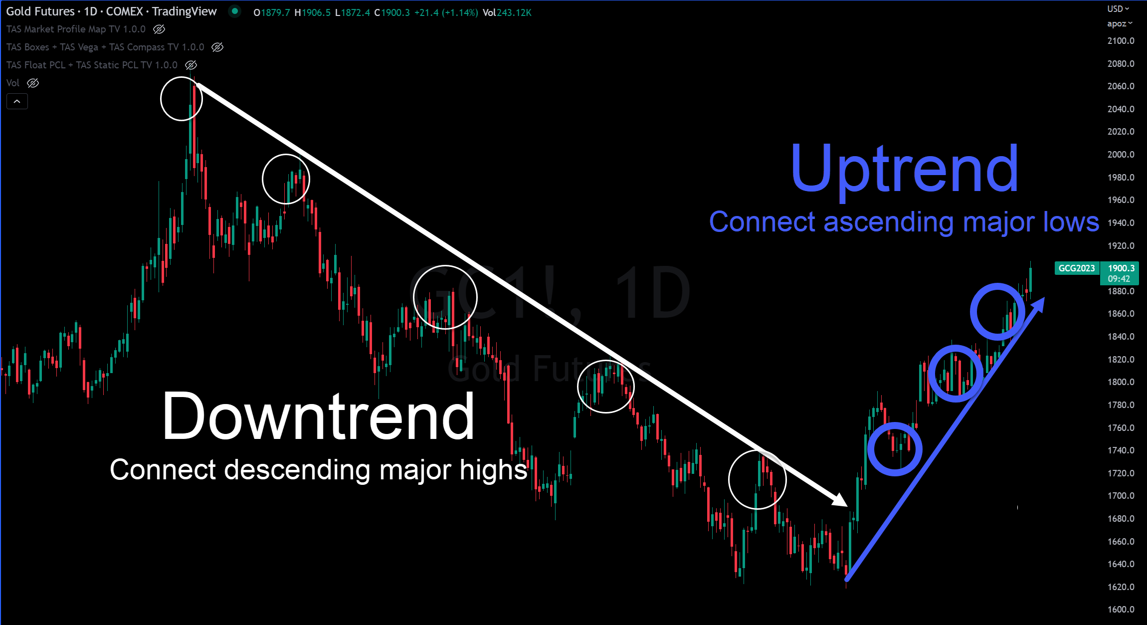
Let's walk through an example with the chart below of GOLD (Daily bars, Jan 1, 2022 through Jan 12, 2023) but keep in mind this technique can be applied to any financial market.

To identify and draw the trendlines, there are a couple basic rules:
DOWNTREND- Connect 2 descending major bar highs to draw a downward trendline and a 3rd connection point provides further validation.
UPTREND- Connect 2 ascending major bar lows to draw an upward trendline and a 3rd connection point provides further validation.
The more validation points that the trendline has the stronger the support or resistance is expected to be at those levels.
BASIC TRENDLINES STRATEGY: A common strategy for utilizing trendlines is to enter a new position (Long or Short) into the market when there is a price bar break and close of the trendline. In the GOLD example above, that would be a close above the white descending trendline. Furthermore, the newly-formed trendline (blue line) can be used to adjust the trailing stops behind the market to reduce risk throughout the evolution of the trade.
That is where it starts and ends for most traders using trendlines. While it can work in perfectly cooperative markets with distinct trend turning points, unfortunately in real world trading the task of generating clear signals exclusively with trendlines is exponentially not so cut and dry.
THE PROBLEM
THERE ARE 3 COMMON CHALLENGES WITH TRENDLINES:
- Hard to identify where the trend has changed until too late.
- Uncertainty about what price exactly to consider a new trade entry.
- Lack of reliable levels for trailing stops (i.e. fake breaks, volatility stop outs)
SOLUTION >>> ADD VOLUME PROFILE FOR CLARITY
When volume profile is added to the same GOLD chart (on display below is the popular TAS Market Map™), you'll see a sequence of horizontal-oriented histograms that deliver relative volume that points in the direction of the price scale (on the vertical Y axis on the right side). The red zones of the TAS Market Maps are referred to as "value areas" and reveal the areas where the majority of volume has accumulated for that period (approximately 70%) and the yellow horizontal lines show the specific price levels with the most volume. This is referred to as the "master point of control" (MPOC). Value areas and MPOCs can be used as reliable support and resistance levels for trading.

As you can see, we add additional confidence to our downtrend assumption on the chart by noting that the major value areas (red zones) are also appearing lower for the three sequential TAS Market Maps™. In doing so, we have successfully added a secondary confirmation of the original simple trendline analysis. However, in the most recent TAS Market Map™ on the right, you'll see the value area has formed higher. This reinforces our analysis that the market has in fact broken the downtrend and now in the first stages of developing a new uptrend.
More Confirmation = More Confidence = More $$$$
Do you see how this works?
Before we continue, it is important to realize the distinct difference volume profile reveals compared to traditional volume information by itself. Volume is typically located in a lower pane of the chart and oriented vertically with histograms that vary in height. It provides a measure of total volume over a period of time (relative to the chosen price bar timeframe) so it serves well as a valid liquidity gauge for traders. Because volume profile is oriented horizontally, it shows what corresponding PRICE ZONES have the most volume. Since it is a layover directly on the price chart, this makes it unmistakable when the market is in the value area versus outside the value area. These areas of high activity result in congestion that often result in areas of sideways and rangebound movement and thus serve as additional support/resistance levels for trading. When the market is outside of these value area zones, they are more likely to move fast and vertically.
As traders, we are responsible for executing on both WHEN and at what PRICE we want to engage the market so volume profile gives us clarity in both areas. Volume alone gives us a measure of liquidity but falls short of telling us precisely when and what price to enter a trade.
TRIPLE YOUR CONFIDENCE WITH DYNAMIC PROFILE (aka TAS BOXES)
At this point, you've learned a simple technique to enhance the reliability of trendlines by adding volume profile to your analysis. You'll already be ahead of most traders with this more intuitive approach to identifying the major trend changes. Let's take it up a final notch by creating a simple 3-step process that reveals the ultimate clarity on trend reversal and a specific entry strategy (in this case, for a LONG signal) by adding Dynamic Profile levels onto the chart. Refer to the chart image below for a visual.
STEP #1- Identify with simple trendline that the market is BULLISH. No special indicator or tool required.
STEP #2- Confirm that trend is BULLISH with volume profile shift higher. (Recommended Indicator = TAS Market Map™)
STEP #3- Await bar close above Dynamic Profile level red dotted line. (Recommended indicator = TAS Boxes™)

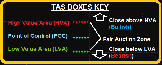
The TAS Boxes™ indicator provides 3 key levels on the chart that give traders real-time awareness of exactly where the current and emerging value area zones reside. This is powerful information that alleviates the ambiguity of where to initiate entries, trailing stops and set profit targets. Below you'll find the legend explaining what the 3 color-coded levels mean.

When TAS Boxes™ are added to the chart you have a clear structured decision-making checklist with multiple confirmations BEFORE putting your risk capital into a trade. The best time to be skeptical of a trading opportunity is BEFORE you are in it and emotionally (and financially) invested.
Note that when deploying this 3-Step confirmation, you are using the TAS Boxes levels as a guide but still respecting the established trendlines and value area zones on the chart. This is particularly true when establishing your initial stops and trailing stops behind the levels. It is normal for the market to explore outside of the TAS Boxes and not uncommon to observe prices testing outside the levels only to resume movement in accordance with the establish trend.
Putting all three of these areas together makes for a Triple Threat confirmation to boost your confidence in your trendlines.
As a trader, your goal is to systematize your decision-making into a structured and repeatable process. This strategy is one example of how to take steps in that direction.
Trade Well,

P.S. Remember, you're just one trade away...
Don't Miss Our FREE Trading Lessons!
We'll email you when new trading videos and articles are posted.
We don't spam or sell your information. That's just not cool.

